First let me apologize to the readers of my blog for not posting in over a month and I know it's been over 4 weeks but I'm still working on the surprise so Hakuna Matata. Until then here is a post for you to devour. So now without further ado.....
Edit: Surprise!!! Brand spankin' new, awesome and incredible design for your viewing pleasure. Hakuna Matata no longer.
CHEYENNE -- Gov. Dave Freudenthal unveiled the final design for Wyoming's state quarter Friday, and the initial reaction from some residents was a resounding, “duh.”
“Did anybody think we were going to do something different than the bucking horse?” asked Cheyenne resident Eileen Calhoon after viewing a picture of the design.
The quarter will feature a silhouette of the state's trademark bucking horse and rider beside the words, “The Equality State.”
The state's name arches over the top of the coin, along with the year it entered the union, 1890. The bottom edge bears the coin production year -- 2007 -- and the Latin expression, "E Pluribus Unum." Read the entire article here
Duh? I frankly was not one who had a resounding duh! My resounding came in the form of, "What the _____!
“Did anybody think we were going to do something different than the bucking horse?”
Om yeah, ME... ME ME ME ME!
Oh I just can't believe it! Wyoming's state quarter is going to be so boring.
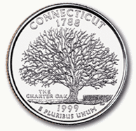
Just look at other state quarters. One of the first state quarters that came out is still one of my favorites. Connecticut's quarter is so beautiful and I can get lost in all those intricut tree limbs...Wow. 
But from what I have just read, Wyoming's state quarter will look something like this.
The most insipid design ever, wouldn't you agree? Come on Wyoming let's be serious. There is already a state with a horse and rider on their quarter. Delaware was the first state and their design of a horse and rider has much more depth than just a silhouette and they had less time to come up with a design. We've had more than seven years and the University of Wyoming logo is all we could come up with!!!

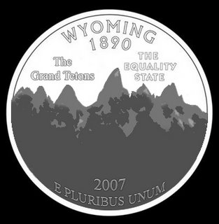
Please I could throw something together in less than ten minutes that would represent Wyoming better. The majestic Grand Tetons are something to behold by all people. I am especially fond of the mountains and so here is what I envision Wyoming's State quarter to be engraved as.
 But Wyoming is dumb and the residents spoke with a resounding, "Duh" that they want to see the bucking horse and rider. Well, well "Duh" Wyoming residents, why not be honest and show true aspects of your great "Equality State?"
That's right. I think this quarter represents Wyoming perfectly. Now this quarter is something I would be mighty proud to flash off as I buy some chewin' tobaccey along with my fellow Wyominites because our great state gave women the right to vote before the 19th Amendment. Because of this our state became known as "The Equality State." Or was that really how we got our nickname? Could it be....?
Mmmmm.... Wouldn't you just love to fondle that quarter? Hey it even has a cowboy on it. No wait two of them. *Drools* That's more than what we get with the approved design of the bucking horse and one rider logo. "Duh" that is so cool.
Ahh ok ok, now that I have gotten this off of my chest I decided to exercise my civic right. I contacted Governor Freudenthal right away to let him know what I thought of the design he approved.
Governor Freudenthal,
I recently read an article in my local newspaper that you have approved the design for the Wyoming state quarter. I have to say that though the bucking horse and cowboy is an image that represents Wyoming culture well, I was a little disappointed that the design doesn't have any interesting qualities. Frankly it is flat out boring and rather dull compared to other state's quarters. Personally, I would like to have our quarter be something that others pick up and say, "Wow that's amazing!" but with the current design I believe others including myself will just pass it off as nothing exciting.
My suggestions to improve the quarter now would be to give it more depth. I would start by giving full detail to the horse and cowboy and to add a background. An engraving of the majestic Teton Mountains, Old Faithful or of Devils Tower behind the bucking horse and cowboy would add a richness and fullness to the design, not to mention being a place to freely advertise these great features of our state to tourists. This will surely give the Wyoming quarter more life and I hope that you will consider it.
Sincerely,
Steven Held
I sent that email on Monday and two days later I received a reply.
Dear Steven Held,
I received your email about the state quarter design. I want to thank you for contacting me and I appreciate your concerns. Unfortunately I have already approved the design in question and it is now with the U.S. Treasury for final approval.
My offices sponsored a state quarter design drive and most of the Wyoming residents sent in ideas centered around the bucking horse and rider with only a few recommendations of such landmarks like the Grand Tetons and Old Faithful. With such overwhelming support I decided to make the bucking horse and rider a part of our state quarter.
However, you have brought up a good argument to combine those elements of Wyoming. I might be able to take your ideas to the U.S. Treasury before their artists strike the final proof. The U.S. Treasury is still awaiting special approval to use the bucking horse and rider logo since it is a state trademark and University of Wyoming logo and the image can't be used on the quarter without express written consent by these institutions.
Steven, I'll see what I can do but I must also keep the other residents of Wyoming in mind and they want to see the bucking horse and rider logo.
Sincerely,
Governor Dave Freudenthal
Residents who said, "Duh" wouldn't you rather have this be your state quarter?

I hope so.


5 comments:
As I was scrolling down and saw that you sent an email to Freudenthal, I was afraid that you had sent the other quarter designs to him. *Phew*
I hope the Treasury instigates your suggestions, though there's no way you can still claim to be a Coloradan.
Hi Steve! Just surfing around and came across yours. Awesome B**g! Nice t-shirt designs..have a good day!
They should have just left the quarter designing up to you in the first place. You certainly would have been the first person I would have consulted. :-) BTW, your Wyoming design kicks butt.
You put so much thought and work in this post. It is incredible. The Brokeback coin is my favorite, and I wish you would submit it to the governer just to give him a good laugh. Do it in all seriousness so he feels bad telling you, "no." (here I am talking about you and the governer like you're BFF and you have a permanent pass into his office.)
Also I like the design, even if it was an accident. It pleases the minimalist in me.
Hi Steve! Thank you so much for stopping by my site again! Of course you can link to me...and I'll do the same for you! have a great day...Rain
Post a Comment