HAPPY BIRTHDAY DAD! Wow, you're half-a-century old! I can't believe that you're 50!
Love,
your son
Thursday, March 30, 2006
Happy Birthday Dad!
Wednesday, March 22, 2006
I'm for real
I came across this little clip of The Simpsons opening credits filmed with real actors. It was created by Britain`s Sky TV network.
"We used regular actors, not so much for their resemblance -- you can`t copy a bunch of yellow characters -- but because you can easily identify with them," a Sky TV spokesman said.
Incredible huh? I thought so.
On a completely different note here is a story of a conversation I had with a telemarketer the other night.
[RING...RING..RINg]
Me: Hello this is Steve.
Telemarketer: Hi Steve this is blah blah from Yada Yada research. I'm conducting a survey and may I ask you a couple of questions?
Me: That's one.
Telemarketer: Ok. How many people live in your residency?
Me: Om... [I still live in the dorms.]... Well...around 220.
Telemarketer: Did you say 220?
Me: Yes.
Telemarketer: Please sir be honest.
Me: I am.
Telemarketer: Alright are you saying that you live with 220 people?
Me: Yes.
Telemarketer: Ok well how many of them are between the ages 18-24.
Me: All of them.
Telemarketer: What? Sir you're not being honest, I can tell when people aren't being truthful and you are one of them.
Me: I'm totally serious. [But now it's time to be mean because he doesn't believe me.]
Telemarketer: Ok sir are you between the ages of 18-24?
Me: No, I'm not.
Telemarketer: What about between 24 and 35?
Me: No.
Telemarketer: Between 36 and 50?
Me: No.
Telemarketer: Between 51 and 65?
Me: No.
Telemarketer: [sounding a bit flustered] Over 65?
Me: No.
Telemarketer: [definitely a little confused] Under 17?
Me: No.
Telemarketer: So... you live with a 250 18-24 year olds and you aren't of any age.
Me: Nope.
Telemarketer: ... Okay then... Have a... uh... nice day...
Me: Sure. You too. [hanging up]
I hate telemarketers.
Thursday, March 09, 2006
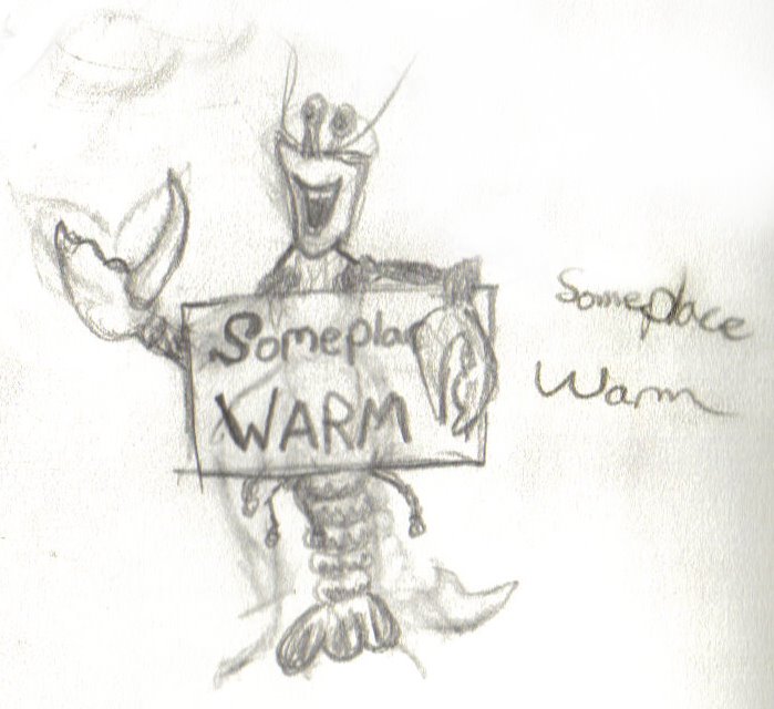
Wishing for Somplace Warm?
It's time to reveal my final t-shirt design. Drum roll please.... ba da ba ba Ba Da ba DA BA DA BADA
TA DA
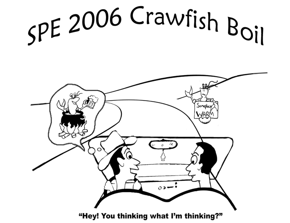
Click for larger image
The first image will go on the back of the t-shirt and the second will go on the front.
and to think it started from this

That's all folks! Cheers!
Saturday, March 04, 2006
Clawing Out My Sketches
In my last post I took you through my initial idea stage and posted my early sketches. I left off by asking if "You're thinking what I'm thinking."
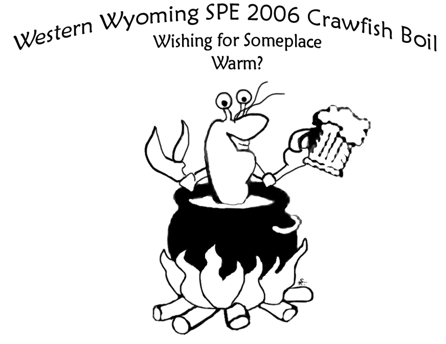
So what is that cowboy thinking? Of putting that crawfish in a nice warm pot of course! The first time I drew the crawfish, he looked too smug. He needed something else, something that would balance his happiness. Aha! I sketched in a beer mug. Yes! This is great!
Also my first hitchhiker looks a little too happy. If he were actually cold, he wouldn't have a big grin on his face. It also doesn't make sense for him to be as happy as the guy in the pot. So I drew another more depressed looking crawfish.
Now normally I have to come up with a number of different ideas to arrive at a finished conglomeration but this sheet of sketches seems to be coming along quite well.
However, looking at the entire sheet of sketches all I could see was a huge mess! Time to go through the process of cleaning things up and redesigning parts.
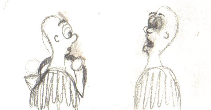
My first order of business.... GUILLOTINE! Yes that's right Mr. Cowboy, you just aren't working over there. Boot to the head! I redrew this part moving Mr. Cowboy and Joe Schmo's heads to the other side and redesigned the car a bit.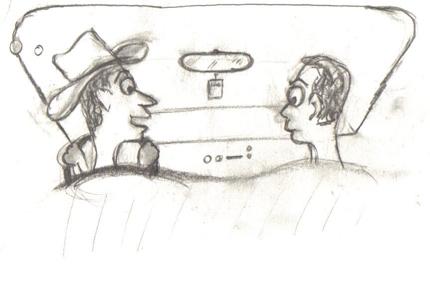
Then I scanned all my sketches into my computer so I could work with them in Photoshop and Illustrator. Now if I had a tablet PC I could've skipped this step entirely and drawn all this out on my computer screen. Maybe someone out there would like to donate or buy me a gift for my birthday?
In my next post I'll show you how I cleaned the images up and put them together for the final design.
Friday, March 03, 2006
On the Side of the Road
A lady from my dad's workplace contacted me to design a T-shirt for their 2006 Crawfish Boil. She gave me free artistic license to do what I wanted but suggested one of her ideas of a crawfish wondering around the cold snowy fields of Wyoming dreaming about a nice warm pot to be boiled in. I decided to go along those lines of what she suggested and began thinking of how best to depict that.
Before sketching I had to know what those little crawfish boogers looked like. This is why I love Google and the Google Image Search. Here's an image I got, dang aren't they ugly?
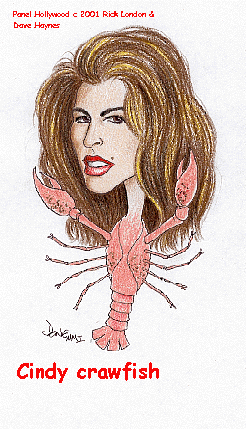
Well that crawfish is fine but seriously who would want that thing on their shirt unless you're Cindy Crawfish? I then searched for crawfish cartoons to see how other artists drew those ugly things so they could possibly look adorable. I came across a page completely dedicated to the creatures. Trapper Arne's Crayfish Page.
Ok... Well that's really facinating Trapper Arne, but as much as I love crayfish, as you call them, I have a project to do. This cartoon image on Trapper Arne's website gave me an idea, not only was this crawfish (or crayfish) nicer looking but it gave me the idea to draw a crawfish hitchhiking out here in Wyoming with a sign saying Someplace WARM. Here are some of my early sketches.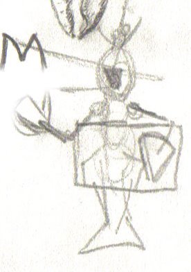
 Then I needed some guys to pick this creature up. Hmmm the guys I drew first are really crude and uglier than crawfish, let's give them some character! Why not a cowboy hat on one. Yeah! Go Cowboys! and some lines to indicate that they are in a car. Viola!
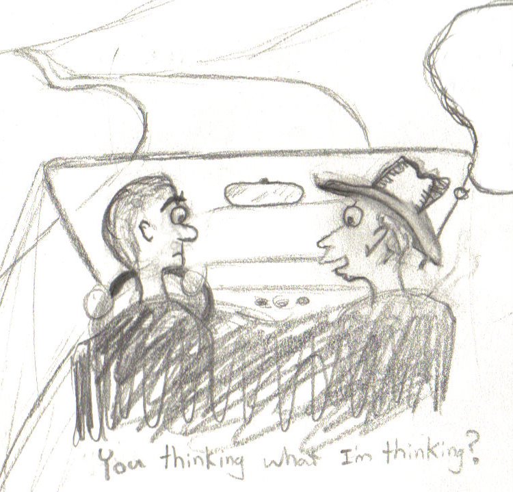
Stay tuned for the next post as I continue my Crawfish T-shirt design and if, "You're thinking what I'm thinking."
Wednesday, March 01, 2006
Goodbye Blues Hello Yellows, Oranges, and Greens
You may be getting tired of hearing how I keep changing my layout/design, so I won't bother and I'll just say that this is an extension to my original post a few days later. Yeah that's exactly it.
Anyway this is the color scheme I have been working on and I wanted to use it earlier but things just didn't look right. In fact they still don't look right because I'm still working on it. I'm still trying to find the correct hues and saturation levels that will just work. I thought I might as well post this style since it does look better than the all blue prior, but it just isn't there in the way that there in bold should make one feel. I'll continue working on my little design patch with my hues little by little, inch by inch. Maybe you lovely people out there have suggestions. If you do they would be appreciated. Please feel free to be as brutal or as kind as you like because in the end I'll ultimately do what I want anyway but I take your comments seriously.
Edit: Things are looking better. I'm still not liking the dark green sidebar but the post background looks good. I'm also trying to change everything over to CSS. It's taking time and that's why a few items are totally outta wack such as my recent bookshelf. I challenge you all to try and change old html (bad) coding to CSS with (good) html.
Edit: Dark green sidebar is history reverted to my trusty blue.
Subscribe to:
Posts (Atom)


